Yesterday I joined many millions throughout the history of humanity and submitted to ritual scarification, of my own volition and free will: I got a tattoo, my first after many years of sworn testimony that I would never do so. Like any complex choice, there was a before and an after—I had been visually imagining and verbally debating such a decision for years, months, and days leading up to the act, which took place on August 11, 2018, in the company of two friends, at the hand of Zach Hewitt at Signature Tattoo on Nine Mile Road in Ferndale, Michigan. The consequences of this act after resonate across time, space, and my work as a writer, beginning now.
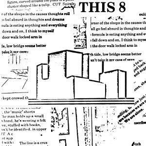
My first thought of a body inscription was imagined, almost eidetically, as a visual image, one that I had brought into existence: the cover of This 8 (1977), a collage of proofs, xeroxes, and typographic scraps left over from the paste-up work on the magazine itself. Xerox was then a new medium for artistic use, and I had already tried it out on the cover of Decay (1976), using multiple Xeroxes to degrade an image of a Los Angeles skyscraper in the 1970s, at the moment of stagflation and neoliberal decline. The inspiration for the collage of typographic waste was in fact an exhibition of the work of the painter Jess at the University Art Museum in Berkeley, though his gorgeous paste-ups create an entirely opposite effect. Scattered among the scraps of proof material were Xerox fragments of postcards showing destroyed villages in World War I, a motif of romantic fragment and ruin, while holding them together was an iconic, modernist structure—a synecdoche of form itself—the image of a three-dimensional, industrial building emerging, as it were, from the two-dimensional plane of the ruins of war and text.
The imagine of the 3-D building, emerging from text, I imagined as likewise emerging from the flesh, a projection of form, both atemporal and ephemeral, coming out of the welter of states that is the body. There was one problem with the image, though: it was corporate, and owned, a logo for the real estate firm Coldwell Banker, and thus would always bear an inscription of capital no matter how appropriated and degraded. Talking about this dilemma with others, I heard that the logo was still in use in the Bay Area, thus canceling out any plans to use it. But the dynamic of text and image on the cover stayed with me as the basis for what I wanted to achieve with my inscription; I kept working it through.
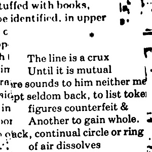
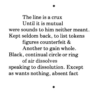
At the lower left corner of the This 8 cover appears a scrap of proof of a stanza from my poem “Silence,” which was set to appear in the issue. That stanza also had an iconic feeling, its off-setting indents making a kind of spatial figure of the lines themselves. The lines, like most of poem, were taken (appropriated) from the footnotes to John Shawcross’s edition of the poems of Donne; the first line, “The line is a crux,” directly refers to an ambiguity of textual interpretation, which could go at least two ways—it is a “crux.” There is a major theological overtone in this use of “crux,” leading on to romantic hermeneutics, and obviously one of the textual entailments of the secular inscriptions of Donne (I had, in fact, studied the metaphysicals with Josephine Miles, so felt both confident and fraudulent in pursuing this thread).
In the absence of the original image, the text would hold forth as its substitute—another moment of theology, with the prohibition of graven images leading to endless text, but degraded, secularized, of course. I started working up the idea, Xeroxing the source in This 8, imagining the entire text as a kind of verbal icon on my left forearm or right upper arm, talking the idea over to whomever would listen (and potentially admire). This is how things stood when I left for travels in Europe, with a file of Xerox test sheets, beginning a series of conversations that decisively put me on my path. The first was with Eva-Léa Le Roux, a guest at the home of Françoise de Laroque and friend of her daughter, Juliette, in the village of Valleraugue in Languedoc. The day we all went to swim in the rive l’Hérault—and now this is turning into the genre of the French summer “nothing” movie on the model of Eric Rohmer’s Claire’s Knee—I noticed a quite literally gorgeous tattoo around Eva’s dancer’s ankle and asked her to explain. Failing by lack of nerve to photograph the tattoo itself, I asked her to write it out, which she did:
On n’écrit pas sur ceux qu’on aime.
or, “one does not write on those one loves.” Even the translation conveys an ambiguity—a crux that is entirely about the relation of text to body, in that one should not write about those one loves, but also that one should not write on those one loves, literally the body being written on, Eva-Léa’s itself. While she did not intend this ambiguity, she found it perplexing and generative of quite a bit of conversation and explanation. The topic turned to my plans for an inscription, which I did not then reveal, and then to Françoise’s grade-school notebooks, a document of exceptional cultural and personal interest for the “rigor of beauty” of second-grade penmanship that was required of a French student in the 1950s. The multiple attempts at a perfect “Q” were inspiring; this is a work that should be published, I believe. The conversation had earlier dwelled on extended appreciation of Georges Perec’s novels Un Homme qui dort and La Vie mode d’emploi, with Juliette’s apartment in the 17th as a possible model for the latter. There was something Perecian, at any rate, in the pleasures of this conversation and the weekend itself.
My next road test of my inscription idea came with a visit with Rachel Levitsky and Dana Greene, pals of Carla Harryman’s then staying at the atelier of Sarah Riggs and Omar Berrada in Paris. Rachel and Dana had just traveled in Corsica, and there was much conversation about smuggling the dog Weinstein in a backpack on the ferry. Dana—whose scholarly/activist work involves photographing and writing on the American prison system—and I got to talking tattoos; she has quite a number of interlocking motifs, with a high correlation of fantasy, tendrils, and the colors blue and green. She was encouraging, and focused on the larger life issues and gender politics of addressing the body this way. The transformation that would result for her is both unexceptional and the kind of desire one does not “give way to.” She also advised separating word from image (I am thinking of a second inscription based on an El Lissitzky Proun). She thought the text tattoo would not be painful but that the solid areas in the Proun would be excruciating. When I left, we exchanged contact info and Dana asked me to update her on my progress, understanding that our conversation meant what it said and that I was on track toward my goal.
The third conversation took place over several days at the home of Etel Adnan and Simone Fattal, in the company of the painter Eugénie Paultre, in Brittany. I do not remember whether Eugénie has a tattoo but I think not; Etel held out against body modification of any sort, leading the conversation to artists such as Stelarc and Orlan; Simone conveyed the absolute freedom that comes of her cosmopolitian perspective and the right of human beings to determine their destinies absolutely—but I cannot remember if she had any advice about whether I should proceed with a tattoo, or even if I showed her my plans. On the way back to Detroit, however, I was convinced that I would be going forward and looked ahead to finalizing a design with my friends on their return from summer travels.
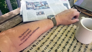
The main issue had to do with size of text. I had ordered the book The Word Made Flesh and was inspired by numerous poets using their work, and the use of poetry itself, as iconic and generative. I wanted the original type face of the publication in This 8, with its plain, vernacular serifs, but would also consider the artier font of the book publication in 1–10 (likely Century Schoolbook and a face that might be named Trump, I need to check). But the tattooist can only go so small without the letters losing definition and filling in, at real risk of a permanent disaster. One friend suggested I limit myself to three lines, and thus began a debate—could I do the entire stanza as the icon I imagined; should I limit myself to half of it, say six lines; or would three suffice. The friends argued for three, and a size much larger (thus involving more commitment of skin) that I had imagined. On the way to the appointment, which one of them had arranged (and before which two IPAs were consumed), I kept asking them “three or six?,” and they would answer, “three!” The content of the lines was decisive too; the first three address the question of meaning itself; the second performs a language-centered dissociation of meaning, with a New York School ampersand, that wants to “gain whole”; while the final lines convey a deathward, existential turn—”speaking to dissolution”—that would make the inscription’s impact both a memento mori and a statement of the postmodern condition, both of which many tattoos in fact are.
That would be much too unwelcome. “I wanted to write a poem,” wrote Williams; what I really wanted is to unite poem and flesh. (Earlier I had a sustained conversation with Carla on the genius of Williams’s line, which transposes the unexceptional desire of “I wanted to be a poet” to the desiring state of writing itself—a movement I would, in my inscription, hope to follow.) In the event, their argument won the day—the use of three lines would point to the stanza, and the poem, as a whole, much like the hyperlinks on this page point to content elsewhere. So that’s interesting: the body, as inscribed, can be hyperlinked to content that is outside the body but is extended from it. With this decision, we were on track to pin down size and font, with Zack holding out for 225% of the book version. The next consideration was placement; relation of text to the length of the arm; angle of inscription in relation to movement and rotation; relation to wrist watch; visibility. What resulted was not what I originally intended; there was a transposition of meaning through the medium, of inscription and the body, that led to something that was not originally in my mind but is now absolutely on my body—and with which I now have to deal.
I need to understand this inscription after the fact of my decision to make it—as a moment of decision writ large across the body and telegraphing its meanings in time. A decision always has a before and after, and the gap between them (or punctual moment itself) is meaning bearing or creating. And what are these meanings? On waking the next day, I first thought of the anthropological implications of being human and joining the millions, of manifold times and cultures, who practice scarification in some form. Fast forwarding to the here and now, most millennials of my acquaintance—many of whom I see as shining lights pointing toward the future—have explored body inscriptions in multiple ways. Going with my friends to Signature Tattoos in Ferndale was in this sense doubly anthropological—and there I was, surrounded by the iconography of death metal, sexual projection, kitsch memorabilia, and New Age fantasy, a kind of hell mouth of the American unconscious in its classed, raced, gendered upwellings. Zach, a graduate of an art school, was reassuringly focused and professional as any variety of tattoo was being applied in the background (I hardly wanted to look). And my friends’ presence was crucial, not as mere reassurance but as a link to the conversations that had brought me there.
The result is visible. It is a three-line fragment of a poem I wrote, probably, in 1976. It refers to the horizon of meaning not only in my work, but more generally. It is a desiring production and embodied.